Proportional Symbol Charts in ggplot2
Using R's ggplot2, we create a Proportional Symbol Chart to illustrate ICH policy patterns across Chinese provinces over time, offering detailed control for enhanced data representation.
The Proportional Symbol Chart offers a quick overview of data distribution by comparing the sizes of symbols. These symbols, typically circles or squares, are proportional in size to the values they represent. This visualization technique can be effectively combined with maps to illustrate geographical distributions, as well as showcase horizontal and vertical data distribution patterns.
In a data journalism project, we aimed to analyze the distribution of policies related to Intangible Cultural Heritage (ICH) across various provinces in China. Our focus was on several aspects: identifying years when individual provinces concentrated on policy implementation, comparing policy enactment across provinces during the same period, and highlighting specific time points when multiple provinces simultaneously introduced numerous policies. For this purpose, we chose the Proportional Symbol Chart as our primary visualization strategy.
Although modern visualization platforms like Flourish can generate Proportional Symbol Charts with simple operations, we opted to use the ggplot2 package in R. This choice was motivated by ggplot2’s capacity to offer more refined control, allowing us to make flexible and precise adjustments to the visualization based on our specific requirements.
Data Collection and Cleaning
Policy data related to Intangible Cultural Heritage (ICH) was primarily sourced from the China Intangible Cultural Heritage Network. This website has compiled various national, ministerial, and local regulatory documents concerning ICH since 2000. We used web scraping techniques to collect these regulatory documents. Some of the entries are as follows:
| Document Title | Year |
|---|---|
| Notice of the People’s Government of Tibet Autonomous Region on Announcing the Sixth Batch of Representative Projects of Intangible Cultural Heritage at the Autonomous Region Level | 2024 |
| Notice of the People’s Government of Ningxia Hui Autonomous Region on Announcing the Seventh Batch of Representative Projects of Intangible Cultural Heritage at the Autonomous Region Level | 2024 |
| Notice of Shanghai Municipal People’s Government on Announcing the Seventh Batch of Shanghai Municipal Intangible Cultural Heritage Representative Project List and the Extended Project List | 2024 |
| … | … |
After analyzing the data, we found that geographical information is typically contained within the first few characters of the document titles. By extracting the names of provinces, autonomous regions, or municipalities (or simply extracting the first two Chinese characters), we were able to create a streamlined dataset containing provinces and years:
| Region | Year |
|---|---|
| Tibet | 2024 |
| Ningxia | 2024 |
| Shanghai | 2024 |
| … | … |
Visualization with ggplot2
Firstly, we need to tally the number of regulatory documents enacted by each province every year.
library(readxl)
library(dplyr)
library(ggplot2)

data <- read_xlsx("data.xlsx")
data <- data %>%
  group_by(year, province) %>%
  summarise(count = n(), .groups = 'drop')
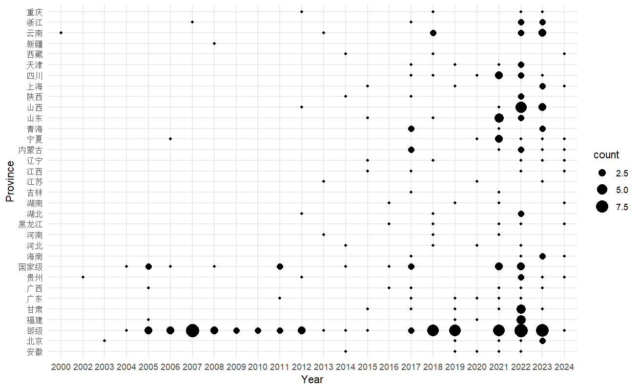
Therefore, we have generated data on the number of regulations enacted each year and by each province. Next, we can proceed to create a Proportional Symbol Chart.
ggplot(datap, aes(x = date, y = province, size = count)) +
  geom_point() +
  theme_minimal() +
  labs(x = "Year", y = "Province")

We can further enhance the appearance of the image by adjusting the parameters.
#Convert to a factor to adjust the size of the points
datap$count <- as.factor(datap$count)
datap$col <- factor(datap$count, level = 1:9, ordered = TRUE)  #Divide into 9 levels, one level for one regulation

plot <- ggplot(datap, aes(x = year, y = province, size = col)) +
  geom_point(color = "#87481f", alpha = 0.5) +  # Set the color of all points to the specified color.
  theme_minimal() +
  theme(
    axis.text.x = element_text(angle = 45, hjust = 1),     #Adjust the angle of the x-axis labels.
    panel.background = element_blank(),  # Remove the background color.
    panel.grid.major.y = element_line(color = "#faf5f0"),  # Change the color of the major horizontal grid lines.
    panel.grid.minor.y = element_line(color = "#faf5f0"),  # Change the color of the minor horizontal grid lines.
    panel.grid.major.x = element_blank(),  # Remove the major vertical grid lines.
    panel.grid.minor.x = element_blank()   # Remove the minor vertical grid lines.
  ) +
  scale_size_manual(values = c(3, 3.5, 5, 6, 7, 8, 10, 12)) +
  labs(x = " ", y = " ", title = " ") +
  guides(size = guide_legend(title = " "))

print(plot)
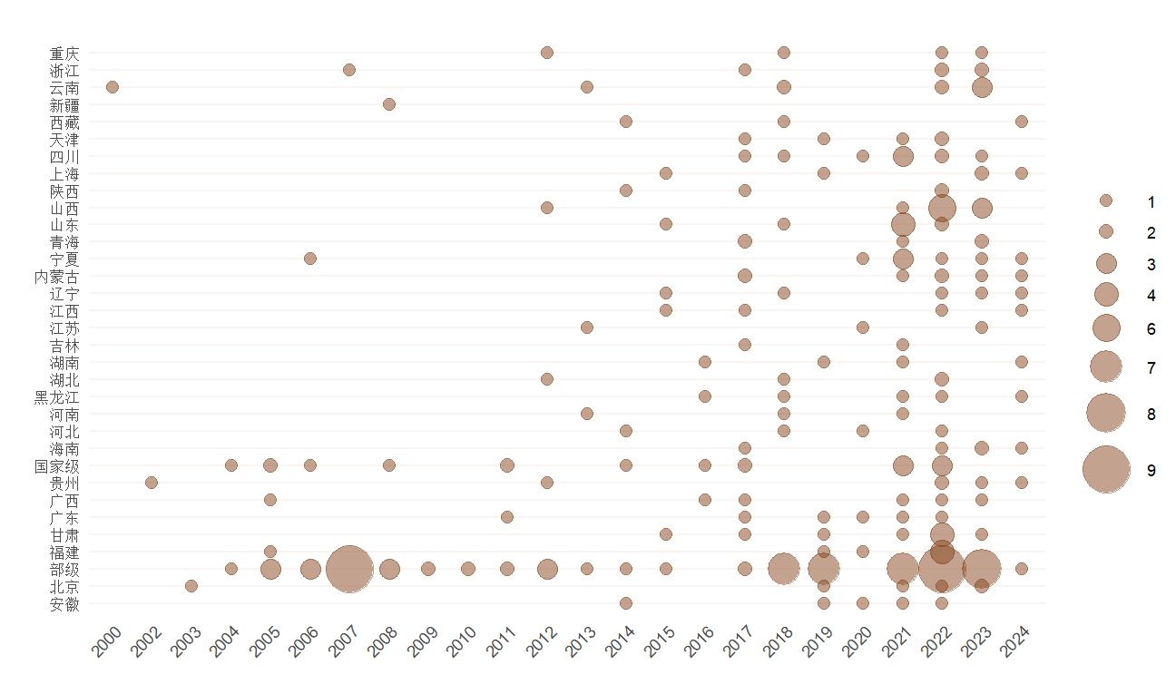
The plotted image looks as follows.

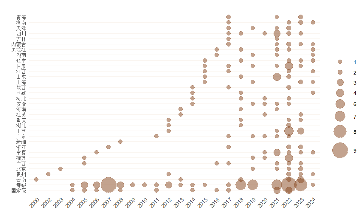
It looks a bit messy? Let’s place the National(国家级) and Ministerial(省部级) levels at the bottom, and arrange the other provinces in order to form the following image.
datap$province <- factor(datap$province, levels = c("国家级", "部级", setdiff(unique(datap$省份), c("国家级", "部级"))))
