Visulization of Multilevel Modeling
A visual guide to multilevel modeling, showing how MLM handles nested data structures in cross-national research.
Introduction to Multilevel Modeling
Multilevel modeling (MLM), also known as hierarchical linear modeling or mixed-effects modeling, is a sophisticated statistical approach designed to analyze hierarchically structured or nested data. This method has become increasingly vital in social science research, particularly when dealing with data organized across multiple levels of analysis.
Simpson’s Paradox and the Need for MLM
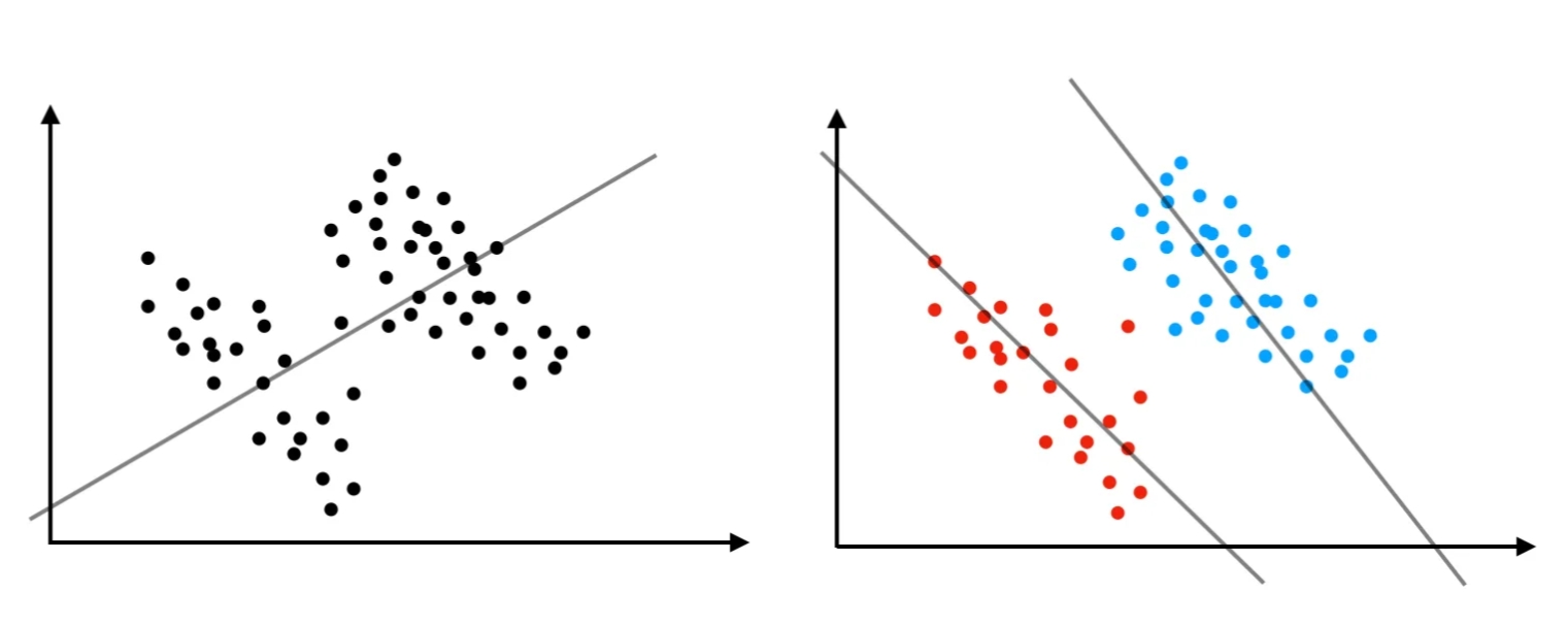
One of the most compelling reasons to employ multilevel modeling (MLM) is its ability to address Simpson’s paradox, a counterintuitive statistical phenomenon that highlights the complex nature of hierarchical data structures. This paradox occurs when a trend or relationship that appears consistently in several groups of data either disappears or, more strikingly, reverses direction when these groups are combined or analyzed at an aggregate level.
The paradox fundamentally demonstrates how relationships between variables can be profoundly influenced by the level at which data is analyzed. It reveals that what appears true at one level of analysis may be false at another, challenging our intuitive understanding of causality and correlation. This makes it particularly problematic for researchers who need to draw accurate conclusions from nested or hierarchically structured data.
Source: Grigg (2018)
Multilevel modeling’s value becomes particularly clear when we consider real-world scenarios like the famous 1975 University of California, Berkeley graduate admissions study. This case perfectly illustrates how data analyzed at different levels can tell seemingly contradictory stories. When researchers examined the aggregate admission rates, they found what appeared to be significant gender discrimination - male applicants had a notably higher overall admission rate (44%) compared to female applicants (35%).
However, when the analysis was conducted at the departmental level, this pattern not only disappeared but actually reversed in many cases, with women showing higher admission rates in most individual departments. This apparent contradiction emerged because the analysis failed to account for a crucial hierarchical structure in the data: departments varied significantly in their competitiveness, and female applicants tended to apply to more competitive departments, particularly in the social sciences, while male applicants were more likely to seek admission to less competitive departments, such as those in the natural sciences. This scenario demonstrates why multilevel modeling is essential - it allows researchers to simultaneously account for both individual-level effects and higher-level contextual factors (in this case, departmental differences), preventing misleading conclusions that might arise from analyzing data at only one level. By incorporating the hierarchical nature of the data directly into the analysis, MLM provides a more accurate and nuanced understanding of complex relationships, helping researchers avoid the pitfalls of Simpson’s Paradox and leading to more informed decision-making.
Source: Split
Multilevel Modeling
Let’s consider a two-level model:
Level-1 Model (Individual Level):
\[Y_{ij} = \beta_{0j} + \beta_{1j}X_{ij} + e_{ij}\]Where:
- \(Y_{ij}\) is the outcome for individual \(i\) in group \(j\)
- \(X_{ij}\) is the predictor variable for individual \(i\) in group \(j\)
- \(\beta_{0j}\) is the intercept for group \(j\)
- \(\beta_{1j}\) is the slope for group \(j\)
- \(e_{ij}\) is the individual-level residual, typically assumed \(e_{ij} \sim N(0, \sigma^2)\)
Level-2 Model (Group Level):
For random intercepts: \(\beta_{0j} = \gamma_{00} + \gamma_{01}W_j + u_{0j}\)
For random slopes: \(\beta_{1j} = \gamma_{10} + \gamma_{11}W_j + u_{1j}\)
Where:
- \(W_j\) is a group-level predictor
- \(\gamma_{00}\) is the overall intercept
- \(\gamma_{10}\) is the overall slope
- \(\gamma_{01}\) and \(\gamma_{11}\) are the effects of group-level predictor on intercepts and slopes
- \(u_{0j}\) and \(u_{1j}\) are group-level random effects, typically assumed:
Combined Mixed Model:
Substituting the level-2 equations into the level-1 equation yields:
\[Y_{ij} = [\gamma_{00} + \gamma_{01}W_j + u_{0j}] + [\gamma_{10} + \gamma_{11}W_j + u_{1j}]X_{ij} + e_{ij}\] \[Y_{ij} = \gamma_{00} + \gamma_{01}W_j + \gamma_{10}X_{ij} + \gamma_{11}W_jX_{ij} + [u_{0j} + u_{1j}X_{ij} + e_{ij}]\]This combined equation shows:
- Fixed effects: \(\gamma_{00}, \gamma_{01}, \gamma_{10}, \gamma_{11}\)
- Random effects: \(u_{0j}, u_{1j}\)
- Cross-level interaction: \(\gamma_{11}W_jX_{ij}\)
Variance Components:
The total variance in \(Y_{ij}\) can be decomposed into:
Level-1 variance: \(\sigma^2\) (within-group)
Level-2 variances:
- \(\tau_{00}\) (random intercept variance)
- \(\tau_{11}\) (random slope variance)
- \(\tau_{01}\) (covariance between random intercepts and slopes)
Intraclass Correlation Coefficient (ICC):
The ICC represents the proportion of variance at the group level: \(\text{ICC} = \frac{\tau_{00}}{\tau_{00} + \sigma^2}\)
These Equations Help Us Understand:
-
Hierarchical Data Structure
The model captures the nested structure of the data, where individuals (level 1) are grouped within clusters or groups (level 2). It allows us to analyze how both individual-level and group-level factors influence the outcome. - Fixed and Random Effects
- Fixed effects (e.g., \(\gamma_{00}, \gamma_{10}, \gamma_{01}, \gamma_{11}\)) estimate the overall relationships and provide insights into how predictors at both levels affect the outcome on average.
- Random effects (e.g., \(u_{0j}, u_{1j}\)) capture variability across groups, indicating how much the intercepts and slopes differ from group to group.
-
Cross-Level Interactions
The term \(\gamma_{11}W_jX_{ij}\) shows how group-level predictors (\(W_j\)) can moderate the effect of individual-level predictors (\(X_{ij}\)), highlighting potential interaction effects across levels. -
Partitioning Variance
The model separates variance into within-group (level-1) variance (\(\sigma^2\)) and between-group (level-2) variances (\(\tau_{00}, \tau_{11}\)). This decomposition helps identify how much of the outcome variation is due to differences within groups versus between groups. -
Intraclass Correlation Coefficient (ICC)
The ICC quantifies the proportion of variance attributable to group-level differences. A higher ICC suggests that group membership plays a significant role in explaining the outcome, emphasizing the need for multilevel modeling. - Correlation Between Intercepts and Slopes
The covariance term (\(\tau_{01}\)) indicates whether groups with higher intercepts tend to have steeper or flatter slopes. This can provide insights into how initial levels of the outcome relate to its rate of change across groups.
MLM in Communication Research
The application of MLM has proven particularly valuable for cross-national research in communication studies. For example: Cross-National Social Media Studies
Diehl, T., Huber, B., Gil de Zúñiga, H., & Liu, J. (2021). Social Media and Beliefs about Climate Change: A Cross-National Analysis of News Use, Political Ideology, and Trust in Science. International Journal of Public Opinion Research, 33(2), 197–213. https://doi.org/10.1093/ijpor/edz040
- Examined the relationship between social media use and climate change beliefs across different countries
- Used random slopes to visualize how social media’s influence varies by national context
Chan, M., & Yi, J. (2024). Social Media Use and Political Engagement in Polarized Times. Examining the Contextual Roles of Issue and Affective Polarization in Developed Democracies. Political Communication, 1–20. https://doi.org/10.1080/10584609.2024.2325423
- Investigated the relationship between social media use and political engagement across the world
- Conceptualized national issue polarization and affective polarization as contextual factors
- Explored cross-level interaction effects
The Power of Random Slopes One of MLM’s most powerful features is its ability to accommodate random coefficients. This means that when conducting cross-national analyses, we can observe how the relationship between variables varies across different national contexts. The effect size and direction of relationships can differ significantly from country to country, providing a more nuanced understanding of social phenomena.
Visualizing Random Slopes in R: A Case Study with World Values Survey Data
When conducting cross-national research using MLM, visualizing random slopes becomes crucial for understanding and communicating results effectively. Here are several strategies for visualizing random slopes in R, each with its own advantages and limitations.
Introduction to the Dataset
We’ll walk through a practical example of multilevel modeling using real-world data from Wave 7 of the World Values Survey (WVS). The WVS is a treasure trove of global public opinion data, covering everything from political beliefs to social values across numerous countries. While the full dataset is extensive and could support complex research questions, for our demonstration purposes, we’ll focus on a straightforward yet interesting relationship: how social media use might influence people’s perceptions of science and technology.
We selected just four key variables from this rich dataset.
- Respondent ID (identifier for each individual)
- Country Code (identifying the country of each respondent)
- Social Media Use (frequency of social media usage)
- Technology Attitude (response to the question “Is the world better off, or worse off, because of science and technology?”)
Let’s first examine our streamlined dataset:
# Load required package for initial data exploration
library(tidyverse)

# Look at the data structure
glimpse(wvs_data)
# Rows: 91,175
# Columns: 5
# $ D_INTERVIEW <int> 20070001, 20070002, 20070003, 20070004, 20070005, 20070006, 20070007, 200…
# $ country     <chr> "AND", "AND", "AND", "AND", "AND", "AND", "AND", "AND", "AND", "AND", "AN…
# $ smu         <int> 5, 1, 5, 5, 2, 5, 1, 1, 5, 1, 1, 5, 4, 1, 1, 3, 1, 5, 5, 1, 1, 2, 1, 1, 1…
# $ tech        <int> 6, 10, 5, 6, 6, 10, 7, 9, 8, 2, 9, 6, 7, 6, 9, 4, 6, 5, 7, 3, 8, 5, 6, 8,…
# $ predicted   <dbl> 6.373340, 7.127683, 6.373340, 6.373340, 6.939098, 6.373340, 7.127683, 7.1…


# Explore technology attitudes by country
wvs_data %>%
  group_by(country) %>%
  summarise(
    mean_tech = mean(tech, na.rm = TRUE),
    sd_tech = sd(tech, na.rm = TRUE),
    missing_tech = mean(is.na(tech)),
    n = n()
  ) %>%
  mutate_if(is.numeric, ~round(., 2)) %>%
  arrange(desc(mean_tech)) %>%
  print(n = 20)
#
# # A tibble: 64 × 5
# country mean_tech sd_tech missing_tech     n
# <chr>       <dbl>   <dbl>        <dbl> <dbl>
#   1 CHN          8.64    1.62            0  2976
# 2 KGZ          8.51    2.37            0  1169
# 3 BGD          8.36    1.73            0  1119
# 4 VNM          8.35    1.58            0  1200
# 5 UZB          8.31    2.19            0  1201
# 6 TJK          8.09    1.96            0  1200
# 7 LBY          7.98    2.51            0  1098
# 8 IDN          7.8     2.37            0  2973
# 9 MDV          7.7     2.09            0  1032
# 10 RUS          7.7     1.94            0  1741
# 11 UKR          7.67    2.05            0  1207
# 12 ETH          7.66    2.99            0  1070
# 13 DEU          7.62    2.24            0  1509
# 14 NZL          7.62    2.01            0   958
# 15 GBR          7.6     2.1             0  2572
# 16 KAZ          7.6     1.98            0  1202
# 17 USA          7.57    2.23            0  2540
# 18 ZWE          7.57    3.07            0  1170
# 19 MAR          7.46    2.22            0  1200
# 20 PAK          7.45    2.75            0  1882
# # ℹ 44 more rows
# # ℹ Use `print(n = ...)` to see more rows
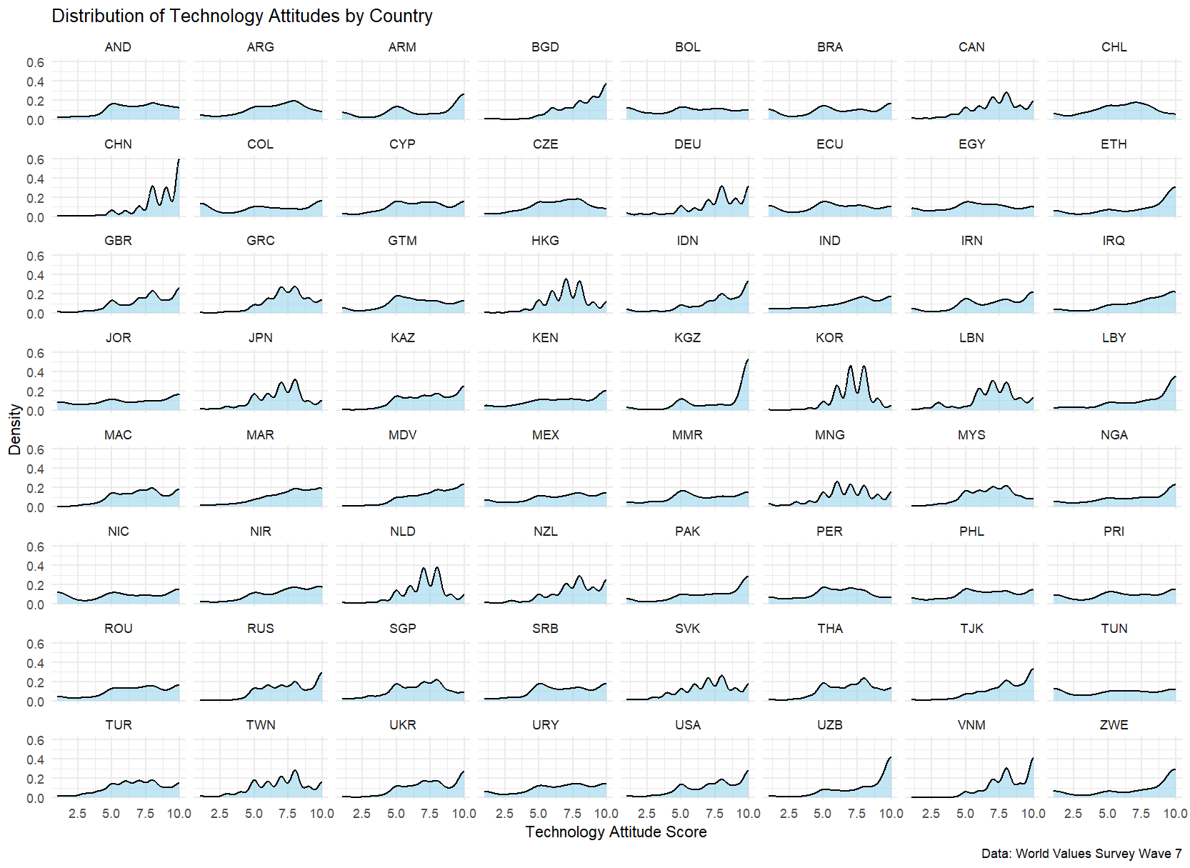
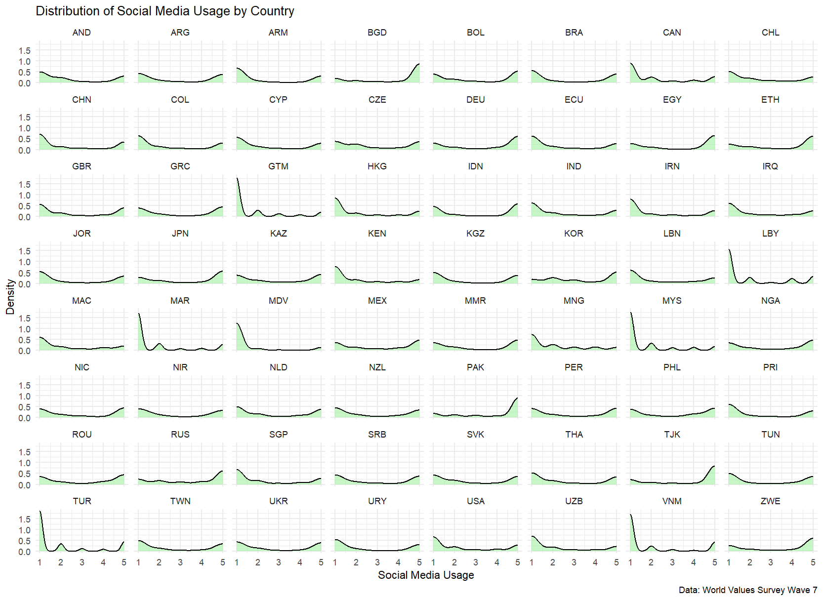
Variable Distributions
Before proceeding with multilevel modeling, let’s examine how our key variables are distributed across countries:
# Create density plots for technology attitudes by country
library(ggplot2)
ggplot(wvs_data, aes(tech)) +
  geom_density(fill = "skyblue", alpha = 0.5) +
  facet_wrap(~country) +
  theme_minimal() +
  labs(x = "Technology Attitude Score",
       y = "Density",
       title = "Distribution of Technology Attitudes by Country",
       caption = "Data: World Values Survey Wave 7")


# Create density plots for social media use by country
ggplot(wvs_data, aes(smu)) +
  geom_density(fill = "lightgreen", alpha = 0.5) +
  facet_wrap(~country) +
  theme_minimal() +
  labs(x = "Social Media Usage",
       y = "Density",
       title = "Distribution of Social Media Usage by Country",
       caption = "Data: World Values Survey Wave 7")
Building the Multilevel Model
The Empty Model
We start with an empty model (also called null model or intercept-only model) to understand how much variation in technology attitudes exists between countries versus within countries.
The model can be written as:
\[Y_{ij} = \gamma_{00} + U_{0j} + R_{ij}\]Where:
- \(Y_{ij}\): Technology attitude score for individual \(i\) in country \(j\)
- \(\gamma_{00}\): Overall mean technology attitude across all countries
- \(U_{0j}\): Random effect for country \(j\) (country-level variance)
- \(R_{ij}\): Individual-level residual
Let’s fit this model:
# Load lme4 package for multilevel modeling
library(lme4)

# Fit empty model
m0 <- lmer(tech ~ 1 + (1 | country), data = wvs_data)
summary(m0)

# Linear mixed model fit by REML. t-tests use Satterthwaite's
#   method [lmerModLmerTest]
# Formula: tech ~ 1 + (1 | country)
#    Data: wvs_data
#
# REML criterion at convergence: 417429.5
#
# Scaled residuals:
#     Min      1Q  Median      3Q     Max
# -3.2032 -0.6107  0.1445  0.7410  1.8554
#
# Random effects:
#  Groups   Name        Variance Std.Dev.
#  country  (Intercept) 0.5361   0.7322
#  Residual             5.6805   2.3834
# Number of obs: 91175, groups:  country, 64
#
# Fixed effects:
#             Estimate Std. Error       df t value Pr(>|t|)
# (Intercept)  7.03637    0.09191 63.03585   76.56   <2e-16 ***
# ---
# Signif. codes:  0 ‘***’ 0.001 ‘**’ 0.01 ‘*’ 0.05 ‘.’ 0.1 ‘ ’ 1


# Calculate ICC using performance package
library(performance)
model_icc <- icc(m0)
print(paste("ICC:", round(model_icc$ICC_conditional, 3)))

# Or calculate ICC manually for verification
var_random <- as.data.frame(VarCorr(m0))$vcov[1]
var_residual <- attr(VarCorr(m0), "sc")^2
ICC <- var_random/(var_random + var_residual)
print(paste("ICC (manual calculation):", round(ICC, 3)))
The model shows an overall tech level of 7.04 (p < 0.001) across 64 countries with 91,175 observations. The ICC of 0.086 indicates that only about 8.6% of the total variance in tech scores can be attributed to between-country differences, while the majority of variation (91.4%) exists at the individual level within countries.
Including Predictors in MLM Models
First, we fitted a random intercepts model that allows baseline technology attitudes to vary across countries while assuming the effect of social media use remains constant:
# Model 1: Random intercepts only
# This model allows different baseline levels for each country
m1 <- lmer(tech ~ 1 + smu + (1 | country), data = wvs_data)

# Linear mixed model fit by REML. t-tests use Satterthwaite's method ['lmerModLmerTest']
# Formula: tech ~ 1 + smu + (1 | country)
#    Data: wvs_data
#
# REML criterion at convergence: 417344.6
#
# Scaled residuals:
#     Min      1Q  Median      3Q     Max
# -3.2311 -0.6251  0.1299  0.7585  1.8916
#
# Random effects:
#  Groups   Name        Variance Std.Dev.
#  country  (Intercept) 0.5391   0.7343
#  Residual             5.6747   2.3822
# Number of obs: 91175, groups:  country, 64
#
# Fixed effects:
#               Estimate Std. Error         df t value Pr(>|t|)
# (Intercept)  7.158e+00  9.302e-02  6.540e+01  76.955   <2e-16 ***
# smu         -4.524e-02  4.671e-03  9.117e+04  -9.685   <2e-16 ***
# ---
# Signif. codes:  0 ‘***’ 0.001 ‘**’ 0.01 ‘*’ 0.05 ‘.’ 0.1 ‘ ’ 1
#
# Correlation of Fixed Effects:
#     (Intr)
# smu -0.135
Fixed Effects:
- The intercept (7.158) represents the average technology attitude score when social media use is zero -Social media use has a small but significant negative effect (-0.045, p < .001), suggesting that higher social media use is associated with slightly more negative attitudes toward technology
Random Effects:
- Country-level variance: 0.539 (SD = 0.734)
- Residual variance: 5.675 (SD = 2.382)
- The presence of substantial country-level variance confirms that technology attitudes indeed vary across nations
We then extended our analysis to allow the effect of social media use to vary across countries:
# Model 2: Random slopes and intercepts
# This model allows both baseline levels and social media effects to vary by country
m2 <- lmer(tech ~ 1 + smu + (1 + smu | country), data = wvs_data)

# Ignore the convergence issue for now.

# Linear mixed model fit by REML. t-tests use Satterthwaite's method ['lmerModLmerTest']
# Formula: tech ~ 1 + smu + (1 + smu | country)
#    Data: wvs_data
#
# REML criterion at convergence: 417147.8
#
# Scaled residuals:
#     Min      1Q  Median      3Q     Max
# -3.2583 -0.6220  0.1565  0.7311  1.9940
#
# Random effects:
#  Groups   Name        Variance Std.Dev. Corr
#  country  (Intercept) 0.446825 0.66845
#           smu         0.005858 0.07654  0.16
#  Residual             5.656817 2.37841
# Number of obs: 91175, groups:  country, 64
#
# Fixed effects:
#             Estimate Std. Error       df t value Pr(>|t|)
# (Intercept)  7.18065    0.08502 62.92945  84.458  < 2e-16 ***
# smu         -0.05403    0.01077 64.85413  -5.017 4.34e-06 ***
# ---
# Signif. codes:  0 ‘***’ 0.001 ‘**’ 0.01 ‘*’ 0.05 ‘.’ 0.1 ‘ ’ 1
#
# Correlation of Fixed Effects:
#     (Intr)
# smu 0.066
# optimizer (nloptwrap) convergence code: 0 (OK)
# Model failed to converge with max|grad| = 0.00960965 (tol = 0.002, component 1)
Key findings from this more complex model:
Fixed Effects:
- The average intercept increased slightly to 7.181
- The negative effect of social media use became stronger (-0.054, p < .001)
Random Effects:
- Country-level intercept variance: 0.447 (SD = 0.668)
- Social media use slope variance: 0.006 (SD = 0.077)
This coefficient is hard to interpret on its own. So let’s try to visulize the results.
Visualizing Multilevel MLM Results
In this part, we’ll explore four different methods to visualize multilevel modeling results, each offering unique insights into our data.
Method 1: Effect Size Visualization with Bar Plots
Our first approcah adopts the method of Diehl et al. (2021) to display both the magnitude and direction of effects.
# Extract random effects from the model
random_effects <- ranef(m2)$country
random_effects$country <- rownames(random_effects)  # Add country names as a column

# Calculate total effects (fixed + random effects)
fixed_effects <- fixef(m2)
total_effects <- random_effects
total_effects$total_smu <- fixed_effects["smu"] + random_effects$smu

# Create the visualization
library(ggplot2)

ggplot(total_effects, aes(x = reorder(country, total_smu), y = total_smu)) +
  geom_hline(yintercept = 0, linetype = "dashed", color = "gray50") +  # Add reference line at zero
  geom_col(fill = "steelblue", width = 0.7) +                          # Add effect size bars
  labs(x = "Country",
       y = "SMU Effect Size",
       title = "SMU Effect Sizes by Country") +
  theme_minimal() +
  theme(axis.text.x = element_text(angle = 45, hjust = 1))            # Rotate country labels
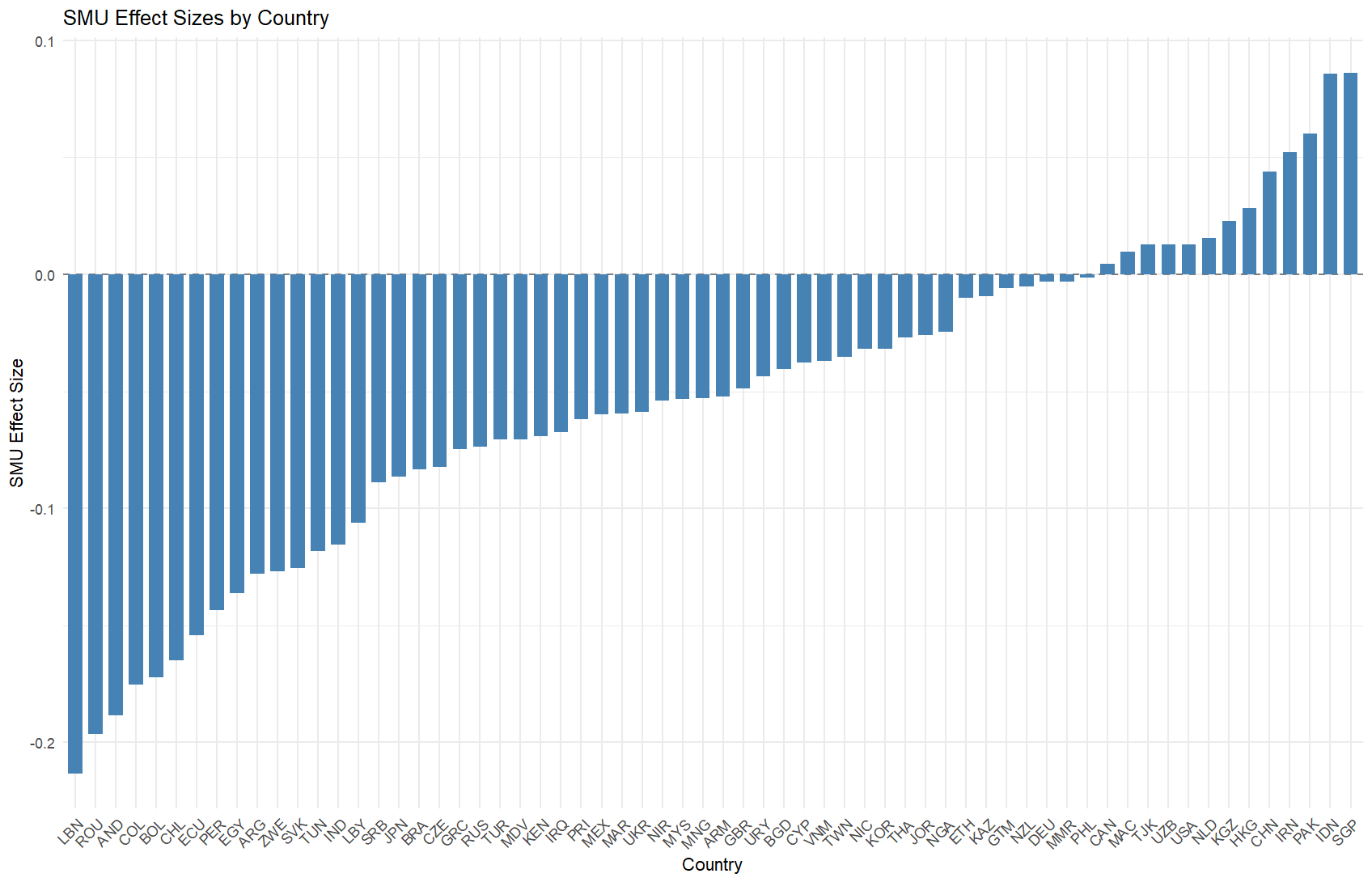
Advantages of Method 1:
- Clear visualization of effect sizes across countries
- Easy comparison of positive and negative effects
- Immediate identification of countries with strongest effects
- Simple to understand for non-technical audiences
Method 2: Predicted Values and Country-Specific Trends
The second method focuses on showing how the relationship between SMU and the outcome varies across countries.
# Generate predicted values
wvs_data$predicted <- predict(m2)

# Create visualization
library(ggplot2)
library(dplyr)

ggplot(wvs_data, aes(smu, predicted)) +
  geom_smooth(se = FALSE, method = lm, size = 2, color = "black") +     # Overall trend line
  stat_smooth(aes(color = country, group = country),                    # Country-specific trends
              geom = "line", alpha = 0.4, size = 1,
              method = lm, se = FALSE) +
  theme_bw() +
  guides(color = FALSE) +                                               # Remove legend
  labs(x = "SMU",
       y = "Predicted Values",
       title = "SMU-Predicted Value Relationships by Country")
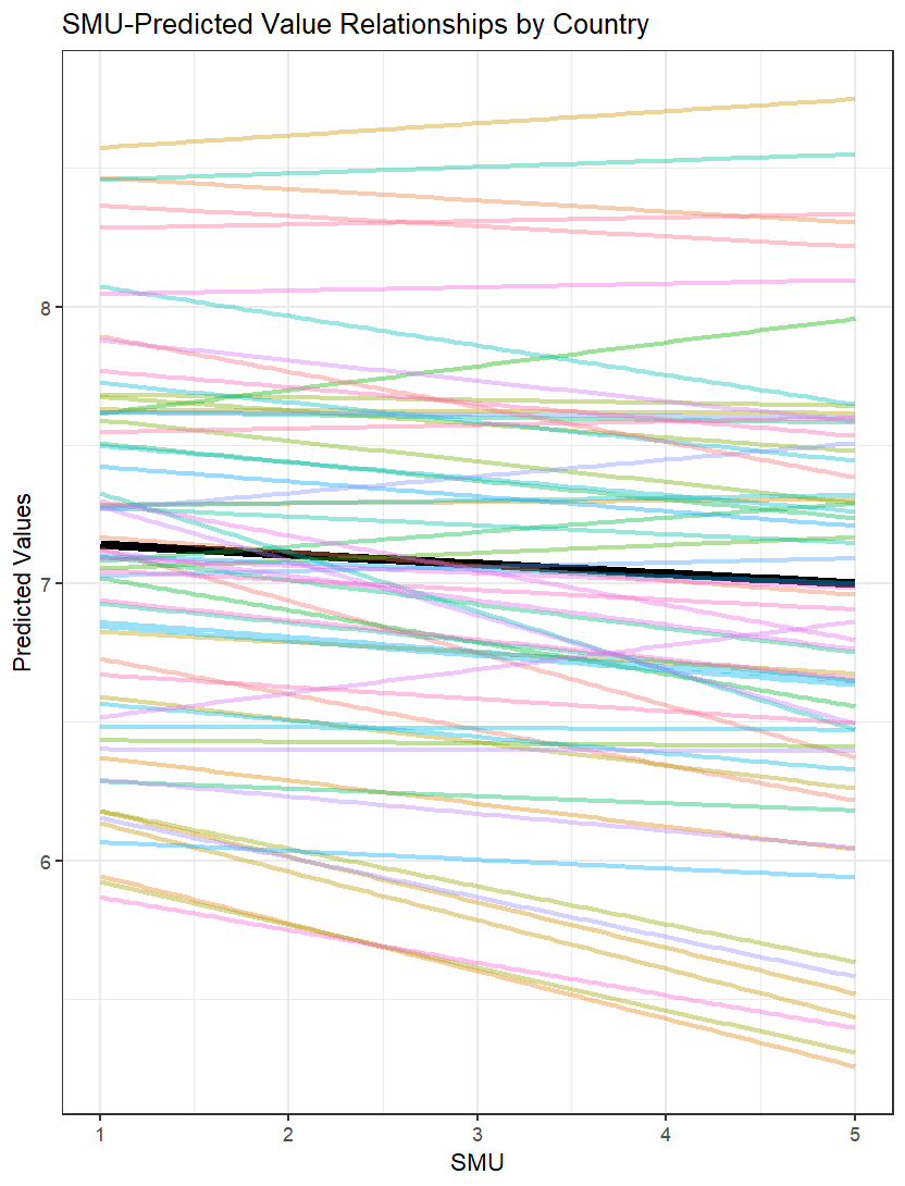
Advantages of Method 2:
- Shows variation in slopes across countries
- Displays the overall trend alongside country-specific trends
- Helps identify countries with divergent patterns
- Useful for understanding interaction effects
Method 3: Forest Plot for Effect Sizes
The third method uses a forest plot to display effect sizes with confidence intervals.
# Calculate necessary components
random_effects <- ranef(m2)$country
random_effects$country <- rownames(random_effects)

fixed_effect <- fixef(m2)["smu"]
random_effects$total_effect <- random_effects$smu + fixed_effect

# Calculate confidence intervals
se <- sqrt(diag(vcov(m2)))["smu"]
random_effects$ci_lower <- random_effects$total_effect - 1.96 * se
random_effects$ci_upper <- random_effects$total_effect + 1.96 * se

# Create forest plot
ggplot(random_effects, aes(y = reorder(country, total_effect))) +
  geom_vline(xintercept = fixed_effect, linetype = "dashed", color = "gray50") +
  geom_errorbarh(aes(xmin = ci_lower, xmax = ci_upper), height = 0.2) +
  geom_point(aes(x = total_effect), size = 3, color = "#E64B35FF") +
  theme_bw() +
  theme(
    panel.grid.minor = element_blank(),
    panel.grid.major.y = element_blank()
  ) +
  labs(x = "SMU Effect Size",
       y = "Country",
       title = "Forest Plot of SMU Effects by Country",
       subtitle = "Dashed line represents overall mean effect")
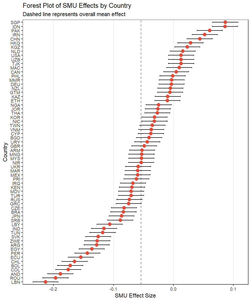
Advantages of Method 3:
- Shows uncertainty in effect estimates
- Clearly displays both effect sizes and their precision
- Easy comparison with overall mean effect
Method 4: Random Effects Correlation Plot
By plotting each country’s random intercept against its random slope, we create a “map” that reveals how countries differ in both their baseline values and their SMU effects. This visualization helps us understand the diversity of country-level patterns and their potential relationships.
# Load required packages
library(ggplot2)
library(dplyr)
library(ggrepel)

# Create scatter plot with labels
coefs_m2$country %>%
  mutate(country = rownames(coefs_m2$country)) %>%
  ggplot(aes(smu, `(Intercept)`, label = country)) +
  geom_point(size = 2) +                                               # Add points
  geom_smooth(se = FALSE, method = lm, color = "steelblue") +         # Add trend line
  geom_text_repel(                                                    # Add non-overlapping labels
    box.padding = 0.5,
    point.padding = 0.2,
    segment.color = "grey50",
    size = 3,
    max.overlaps = Inf
  ) +
  theme_bw() +
  labs(x = "Slope (SMU Effect)",
       y = "Intercept",
       title = "Random Effects: Slope-Intercept Relationship")
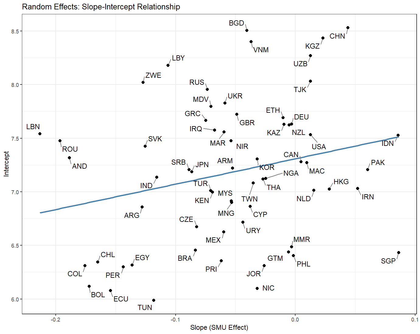
Advantages of Method 4:
- Reveals patterns in random effects structure
- Shows relationship between slopes and intercepts
- Helps identify outlier countries